On this page
The cool-gray era is winding down. Here's what's replacing it, how Valley sunlight changes the way a slab reads, and how to choose a color you'll still like in ten years.
If you shopped for quartz countertops in Phoenix five years ago, you were almost certainly looking at a bright white slab with fine gray veining. That combination defined a decade of kitchens, and plenty of Valley homes will keep it. But walk our showroom floor today and the center of gravity has shifted noticeably warmer.
Below are the quartz countertops colors leading 2026, and, more usefully, how to tell which one will actually work in your kitchen. Phoenix light is not neutral light, and a slab that looked perfect under showroom fixtures can read very differently at 3 p.m. in a west-facing kitchen.
What actually changed in 2026
The clearest signal isn't coming from stone. It's coming from paint. All three major paint brands landed on warm, grounded neutrals for 2026. Sherwin-Williams and HGTV named Universal Khaki SW 6150, a sandy mid-tone between beige and taupe. Benjamin Moore chose Silhouette AF-655, a soft espresso brown with charcoal in it. Behr went with Hidden Gem, a muted earthy teal. Three independent forecasting teams, three warm picks, no cool grays in the group.
Quartz manufacturers moved the same direction. The 2026 collections from the brands we stock lead with creamy and ivory bases carrying gold, bronze, taupe or cinnamon veining, plus sandy neutrals and soft warm grays. The engineering hasn't changed much. The palette has.
Underneath it is a shift most people recognize on sight: kitchens are being asked to feel comfortable rather than clinical. Natural wood is back on cabinet doors, matte finishes are outselling high-gloss, and hardware has moved toward brass and warm nickel. A cool blue-gray countertop in the middle of that starts to feel like the odd element.
Before you choose a color
Selection gets easier when you see real slabs instead of thumbnails. Our Phoenix showroom carries the widest quartz selection in the Valley, and you can view full pieces, not four-inch chips.
Warm white and cream quartz
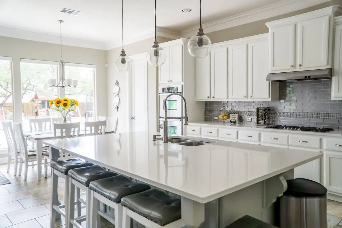
This is the headline category for 2026, and it's worth being precise about what separates it from the white quartz of the last decade. Both are "white." The difference is undertone. A cool white carries a faint blue or gray cast that reads crisp and slightly clinical. A warm white carries cream, ivory or soft gold, so the same brightness reads softer.
Warm whites are also more forgiving of what surrounds them. Cool white demands everything else stay cool too, one warm oak floor and the counter looks bluish. A cream-based slab sits comfortably next to painted cabinetry, wood, brass hardware and warm flooring.
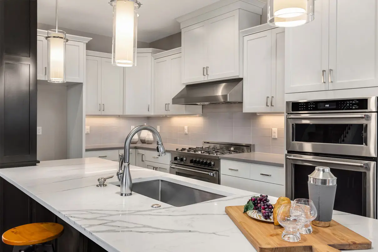
In our quartz color selection, this family includes options such as Calacatta Taj, which takes its cue from Taj Mahal quartzite. Pull a warm white and a cool white under the same light before deciding. The gap is obvious side by side and nearly invisible one at a time.
Beige, tan and earth-tone quartz
Beige spent fifteen years as a punchline in kitchen design. It's back, and the version that returned is better than the one that left. Today's earth-tone quartz reads as sand, clay or warm stone rather than the flat yellow-beige of early-2000s builder kitchens, and most carries subtle flecking or soft movement instead of a uniform field of color.
This family fits the Valley for reasons beyond taste. Sand and clay tones echo what's outside the window, and in a house with a lot of glass that continuity does real work. Slabs like Desert Mist and Sedona River sit in this territory, and both take warm wood and brushed metal well.
Deeper browns are the other half of the movement, helped along by the same shift that put an espresso brown atop Benjamin Moore's 2026 palette. A dark brown island against lighter perimeter counters is one of the more confident looks available right now, and it ages better than a black island because brown reads as a color rather than an absence of one.
The three-light test. Look at a sample in your own kitchen at three points: mid-morning, mid-afternoon, and after dark with only your overhead and under-cabinet lights on. Warm bulbs pull out beige and gold. Cool bulbs push a slab toward gray. Phoenix daylight does something different again. If a color holds up in all three, it holds up every day.
Calacatta-inspired veining, warmed up
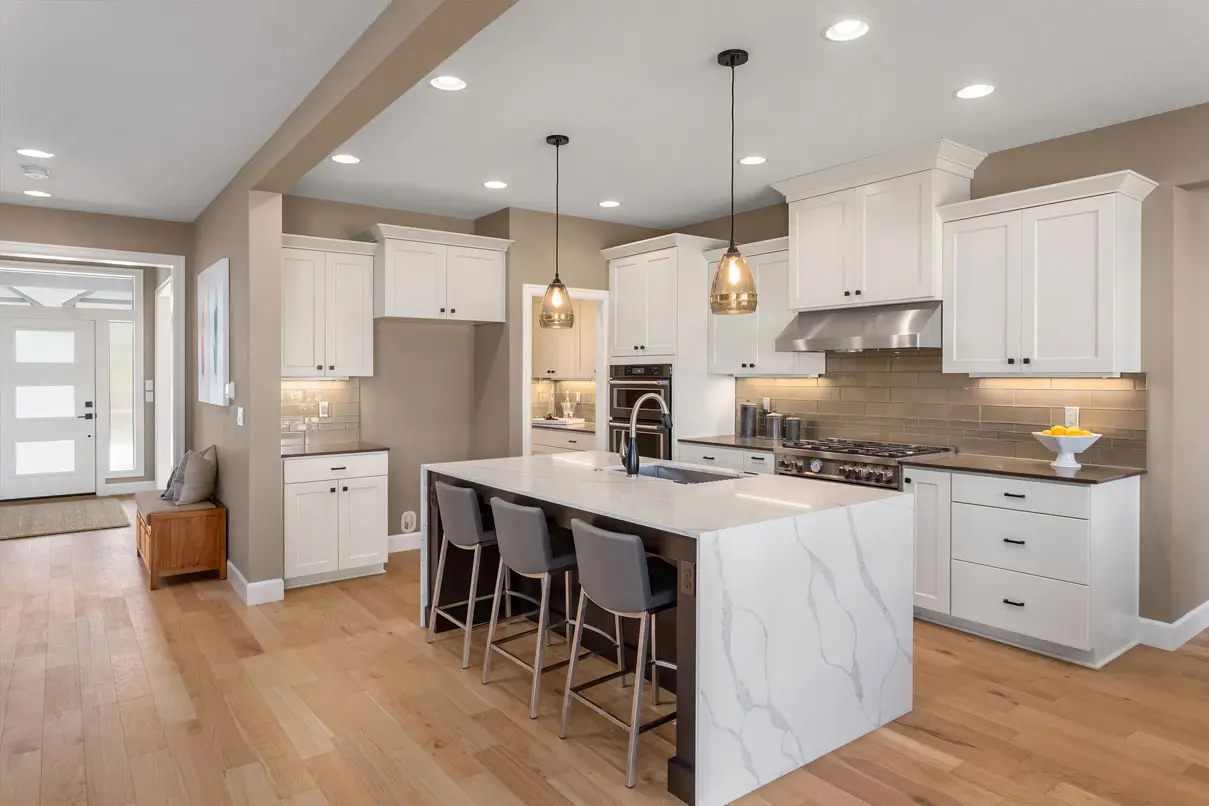
Marble-look quartz isn't new. What changed is the vein color. The Calacatta-inspired slabs leading 2026 carry gold, bronze and cinnamon veining rather than the cool gray that dominated the last cycle, same dramatic silhouette, entirely different temperature.
There's a practical argument alongside the visual one. Natural Calacatta marble is beautiful and genuinely demanding: porous, reactive to acids, and in need of periodic sealing. Quartz gives you a comparable look in a non-porous surface that most manufacturers say rarely needs sealing. Our guide to marble vs. quartz vs. granite covers the tradeoff in detail.
Two worth pulling: Calacatta Oro, where the gold veining is the point, and Carrara Roma for finer, quieter movement across a long run.
Greige and gray: what's still working
Gray hasn't disappeared, and anyone telling you your existing gray counters are dated is overstating it. The category narrowed: cool, blue-leaning grays are losing ground fastest, while warmer grays, greige and mid-tone charcoal still sell well.
Greige is the most useful survivor. It carries the warmth of beige and the discipline of gray at once, making it one of the few neutrals that sits comfortably next to both warm wood and crisp white cabinetry. If you're renovating in stages and don't yet know what the cabinets will be, greige buys the most room to change your mind. Antique Taupe from the Viatera line is a good place to start.
What customers say
Phoenix homeowners love the results.
Showed up at their showroom / warehouse… picked out a countertop easily, scheduled, installed 2 weeks later. PHENOMENAL quality of installation.
Matthew S. · GoogleWe were able to find a countertop that fit our larger island without any seams, and at a great price as well.
Doug M. · GoogleGreat selections with reasonable price and very helpful workers.
Han D. · Google





Concrete-look and brushed finishes
The smallest of the 2026 movements, and the one most likely to feel dated soonest, but genuinely good in the right house. Concrete-look quartz delivers the raw texture of poured concrete in a non-porous surface, without the cracking and sealing that real concrete counters bring.
The more interesting development is finish rather than color. Brushed, honed and textured surfaces are showing up across every color family now. Sonoro Brushed Quartz shows what texture does to a slab: it kills glare, adds a tactile quality, and, relevant here, doesn't throw harsh reflections when afternoon sun comes through a west window.
See these colors in person, not on a screen
Screens and photographs both shift color. The only reliable way to judge a slab is to stand in front of it. Walk our Phoenix showroom, or have a designer bring samples to your kitchen.
Get a Free In-Home EstimateHow Phoenix light and climate change color
This is the part most trend articles skip, and it matters more here than almost anywhere else. Phoenix does not have neutral light. We get intense sun most of the year, and that light amplifies whatever undertone a slab already carries.
Desert daylight exaggerates undertone
A cool white that looked crisp under showroom fixtures often reads colder and flatter in a Valley kitchen with big windows. A cream slab with gold veining can read warmer than expected, occasionally closer to yellow. There's bounce light too: sun off a pool deck, pavers or a painted block wall adds its own cast for hours a day. That isn't a reason to avoid a color. It's a reason to test it in the room.
Hard water shows most on dark polished tops
Valley water is hard. Around sinks and faucets, dried droplets leave pale mineral rings, most visible on very dark, high-gloss surfaces where they contrast sharply. If your household isn't going to wipe the sink area down daily, and most aren't, a mid-tone slab with movement is far more forgiving than a polished near-black.
Desert dust is the opposite problem
Fine dust settles constantly here, especially through monsoon season, and it's most obvious on those same dark, high-gloss surfaces. A honed, matte or brushed mid-tone reads clean longer between wipe-downs, one of the few cases where the practical answer and the trend-forward answer agree.
Two Phoenix cautions worth knowing
- Quartz and outdoor kitchens don't mix well. Quartz is ground stone bound in resin, and prolonged direct sun can cause fading or discoloration over time. Manufacturers typically exclude outdoor installations from coverage. For a patio kitchen or outdoor bar, granite or quartzite is usually the better call.
- Quartz is heat-resistant, but not immune to heat. The resin binder can scorch or discolor under a pan straight off a burner. Use trivets, particularly on lighter slabs where a mark shows more clearly.
Pairing quartz with cabinets, paint and hardware
Most countertop regret isn't about the countertop. It's about the combination. A slab that looked beautiful alone ends up fighting the cabinets, the floor or the wall color, and the room doesn't quite settle.
The rule that prevents most of it is simple: pick one temperature and hold it. Warm quartz with warm cabinetry, flooring and paint. Cool with cool. Within one temperature you can go tonal or high-contrast and it still reads as intentional. Mix temperatures and the room reads as separate decisions.
Warm quartz works with
Natural wood in white oak, walnut or cherry. Cream, greige and mushroom paint. Brass, bronze and warm nickel hardware. Travertine and warm-toned tile.
Cool quartz works with
Crisp white and blue-gray cabinetry. Cool gray porcelain or large-format tile. Chrome, polished nickel and matte black hardware. Higher-contrast, contemporary rooms.
Where to add the trend
Paint, hardware, pendants, stools and backsplash tile are all changeable in a weekend. If you want to chase a color, chase it here rather than on the counters.
The most common mistake
Choosing quartz and cabinets in separate visits weeks apart, from memory. Undertone comparisons only work when both samples are physically next to each other in your own light.
If cabinets are part of the same project, select both together rather than sequentially. Our cabinet selection and our quartz sit in the same building, which makes a side-by-side comparison straightforward.
Choosing a color you won't tire of
Some parts of a kitchen are easy to change and some aren't. Sorting decisions into those two buckets settles most of the "will this date?" question.
| Color family | Best suited to | Phoenix note | Watch for |
|---|---|---|---|
| Warm white / cream | Wood or painted cabinets, brass hardware | Reads warmer in Valley daylight than in the showroom | Can look yellow beside a cool bright-white door |
| Beige / earth tone | Desert-contemporary and transitional kitchens | Echoes the exterior palette; hides dust well | Flat beige without movement reads builder-grade |
| Warm-veined Calacatta | Islands, waterfall panels, backsplashes | Movement disguises spotting better than flat color | Oversized veining gets cropped on small surfaces |
| Greige / warm gray | Staged remodels, undecided cabinet colors | The most forgiving all-around choice here | Cool blue-grays are fading fastest |
| Concrete-look / brushed | Modern and industrial kitchens | Matte texture kills afternoon glare | Strongest statement; shortest likely trend life |
Four families, ranked by staying power
Soft white, warm white and light cream
In favor across multiple style cycles, and appealing to the widest range of buyers if resale is a factor. They also leave you free to change paint and hardware later.
Beige, greige and sandy neutrals
Gaining ground and unlikely to date quickly, because they're neutrals rather than statements. The desert-adjacent tones have a durability here they may lack elsewhere.
Warm-veined Calacatta and dark browns
Strong, current and genuinely beautiful. Put them where they can be enjoyed and, if needed, changed (an island, a vanity, a bar top) not across every run of counter.
Concrete-look, industrial and specialty greens
Excellent in the right house, out of place in the wrong one. Choose these because the rest of the home already supports them, not because they're new.
Before you sign off on a slab
- View a sample in your own kitchen, not only in the showroom
- Check it at three points in the day, including after dark under your lights
- Hold it against a cabinet door, a flooring sample and your paint chip
- Decide whether the counter should be the focal point or the background
- Match vein scale to the size of the surface it's going on
- Look at the full slab where possible, not just a four-inch chip
Bringing it together
The 2026 quartz countertops colors story is a genuine shift, not a reshuffle: warm has replaced cool as the default, creamy bases with gold and bronze veining have replaced bright white with gray, and finish is now as much of a decision as color.
None of that should override the two things that decide whether you'll still like your counters in year eight: how the color behaves in your light, and whether it agrees with the finishes around it. Trends narrow 200+ options to a handful. Your own kitchen decides the rest.
Superior Stone & Cabinet is Phoenix's one-stop shop for kitchen and bathroom remodels. We handle countertop selection and installation in granite, quartz, quartzite and marble, including the Silestone range, along with custom cabinetry, tile, flooring and complete kitchen remodeling services. Free in-home estimates are available across the Valley.
Frequently asked questions
What quartz countertop colors are trending in 2026?
Warm tones lead 2026. The dominant look is a creamy or ivory base with gold, bronze or taupe veining rather than bright white with cool gray veining. Sandy earth tones, greige neutrals and brushed concrete-look surfaces round out the year, with nature-inspired greens appearing mostly on islands.
Are gray quartz countertops out of style in 2026?
Not out of style, but narrowed. Cool blue-leaning grays are losing ground fastest, while warm grays, greige and mid-tone charcoal still sell well. Mid-tone gray with visible movement remains one of the most practical choices for a Phoenix kitchen, because it hides dust and water spotting.
Should quartz countertops match or contrast with kitchen cabinets?
Undertone matters more than either. A creamy quartz that looks soft against walnut can read yellow beside a cool bright-white door. Pick one temperature, warm or cool, and hold it across countertop, cabinets, flooring and paint. Within that temperature, tonal and high-contrast both work.
Does Phoenix sunlight change how quartz colors look?
Considerably. Intense Valley daylight amplifies whatever undertone a slab already carries, so cool whites read colder and gold-veined creams read warmer than they did in the showroom. Light bouncing off a pool deck or block wall adds another cast. Test samples in your own kitchen.
Which quartz colors hide hard water spots and desert dust best?
Mid-tone slabs with visible movement hide the most. Phoenix water is hard, and dried mineral rings show up most on very dark polished surfaces. Fine dust is most obvious on those same dark, high-gloss tops. A honed or brushed mid-tone stays looking clean longest between wipe-downs.
Do warm white quartz countertops still work with white cabinets?
Yes, if the two whites share an undertone. Warm ivory quartz beside a warm off-white door reads layered. The same slab beside a cool blue-based white often reads dingy, because the eye compares them directly. Hold both samples side by side in the room before deciding.
Can I use quartz countertops on an outdoor kitchen in Phoenix?
Most quartz is not recommended outdoors. It is ground stone bound in resin, and prolonged direct sun can cause fading or discoloration over time, which is why manufacturers typically exclude outdoor installations from coverage. For patio kitchens, granite or quartzite is usually the better material.
How do I choose a quartz color I will not tire of?
Separate what is easy to change from what is not. Paint, hardware and pendants can be swapped in a weekend, so follow trends there. Countertops and cabinets stay for years, which favors soft whites, warm beiges and subtle veining. Put a bold slab on an island.
Find your color at the Valley's largest showroom
See full slabs in person and take samples home before you decide. Or book a free in-home estimate and we'll bring the samples to your kitchen.
Tour Our Showroom Or call (602) 437-0088 · 3479 E University Dr, Phoenix, AZ 85034Keep reading
Related articles
Cabinets: Cabinet Color Trends 2026
Cabinet color trends 2026: deep greens, warm neutrals and moody blues. See what works in Phoenix light and book a free in-home estimate.
Granite Counters · August 17, 2026Granite/Countertops: Countertop Color Trends 2026
Countertop color trends 2026 favor warm whites, greige and rich browns. See what works in Phoenix kitchens and baths.
Quartz · July 29, 2026Why Phoenix Buyers Choose Quartz Countertops
Why Phoenix homeowners choose quartz countertops: non-porous, low-maintenance, hard-water friendly, and durable — plus the one place it isn't the right pick.
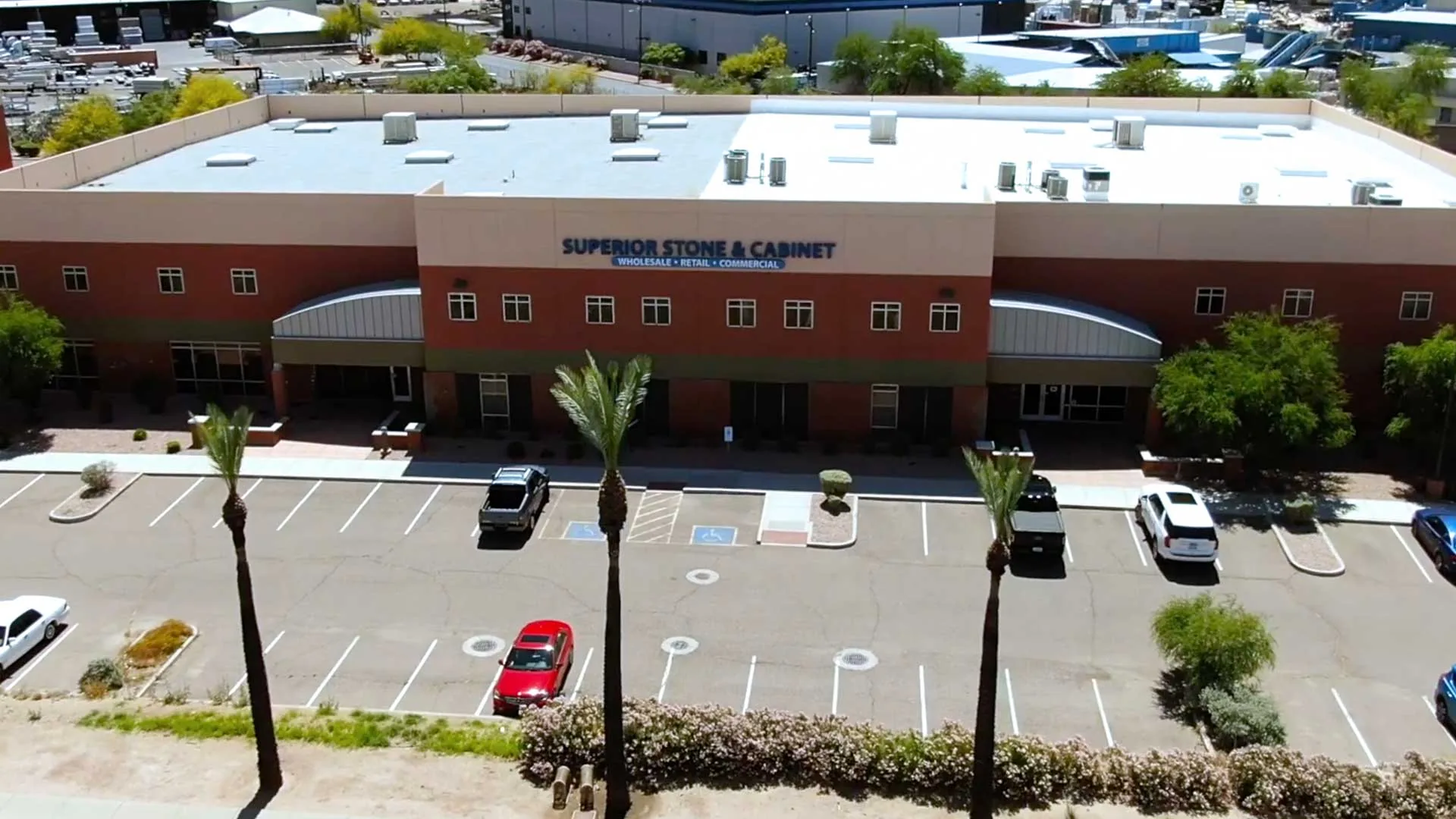
Visit the showroom & warehouse
Pick your exact slab in person.
Walk the slab racks, compare colors side by side, and talk with an on-site designer. No appointment needed.
| Mon – Fri | 8 am – 5 pm |
| Saturday | 10 am – 3 pm |
| Sunday | Closed |
| Warehouse pickup Mon–Fri 8 am – 3 pm | |