On this page
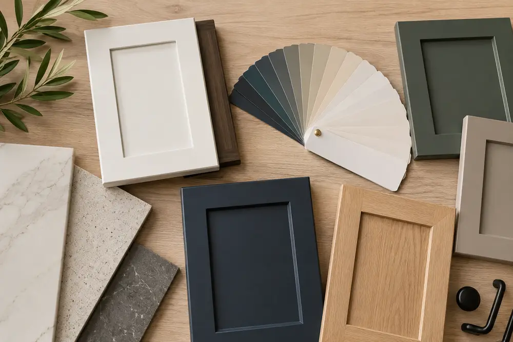
Deep greens, warm neutrals and inky blues are replacing cool gray and stark white, and desert light changes how each one reads.
Shop cabinets five years ago and you were choosing between white, gray, or a wood stain. That menu has widened. The 2026 palette is warmer, deeper and more willing to commit to an actual color, and it is showing up on perimeter cabinets now, not just islands.
Trends tell you what is available and being made well right now, which matters when you are ordering doors. They do not tell you what will look right in your kitchen, a color that photographs beautifully in a Pacific Northwest showroom can read completely differently under Phoenix light in June. Here is what is trending, what is fading, and how each family behaves in a Valley home.
What Changed in 2026
The short version: the industry moved from cool to warm, and from flat to complex. For most of the 2010s the default kitchen was bright white plus blue-based gray, palettes that photographed well and sold houses, but produced a lot of rooms that felt more like showrooms than kitchens.
What is replacing them is not louder. It is deeper. Designers are reaching for muted shades with visible undertones: olive rather than lime, mushroom rather than gray, indigo rather than primary blue. The paint companies moved the same direction. Sherwin-Williams named Universal Khaki SW 6150 its 2026 Color of the Year; Benjamin Moore chose Silhouette AF-655, a deep espresso brown.
In NKBA industry research, 86% of designers expected green to lead kitchen color palettes as an accent color, with blue close behind at 78%.
Placement changed too. More homeowners are running a shade across the full perimeter, or splitting the room between a painted lower run and a stained upper. If you are planning a kitchen remodel, this is the decision worth your time, cabinet color sets the tone for every other finish.
Deep Greens and Earth Tones
Green is the headline color of 2026, but the shades have moved. The soft sage that dominated 2020 through 2024 is giving way to deeper greens: olive, moss, juniper, forest, blackened teal. These read grounded rather than sweet, and hold up better long term.
Olive and moss
Yellow-green undertones that warm up under warm LED light. Works against white oak, brass and honed natural stone. A strong pick for kitchens with limited light.
Forest and juniper
Richer, with more blue in the mix. Best in larger rooms, or on a lower run under a lighter perimeter. Pairs cleanly with gray-veined quartz.
Blackened teal
Reads nearly black in low light and green in daylight. A quieter route to a dark kitchen than true black, and it hides everyday wear well.
Sage and soft green
Still widely used, especially in smaller kitchens where a deeper green would close the room in. Just no longer the default it was.
Earth tones sit in the same family: terracotta, clay, warm red-browns, and the burgundy and oxblood now appearing on islands and butler’s pantries. Those are bolder and more polarizing, better suited to a contained area than a whole room.
Worth knowing: greens and earth tones shift noticeably under different light temperatures. Look at doors in your own kitchen morning, midday and evening before ordering, a large sample door beats a paint chip. Our designers can send samples home from our product gallery.
Warm Neutrals and the New Whites
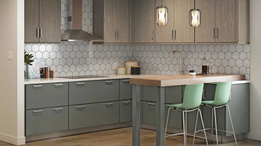
If green is the headline, warm neutrals are the volume story. Mushroom, putty, greige, khaki and sand tones are where most 2026 kitchens actually land. They give the low-commitment quality people wanted from gray without the cool undertone that made so many gray kitchens feel flat.
Mushroom, putty and stone
Soft tones between beige and taupe, often with a faint brown or green undertone. They let natural materials do the talking: wood grain, stone veining, textured tile.
Greige and khaki
The direct replacements for cool gray. Enough gray to feel neutral, enough warmth to feel finished. Sherwin-Williams putting Universal Khaki forward for 2026 is a fair indicator of where this is heading.
Creamy and warm whites
White is not going anywhere. It warmed up. Alabaster, cream and soft off-whites have largely replaced blue-based bright whites, and pair more comfortably with the marble-look quartz that stays popular here.
To be clear: white remains one of the most requested finishes we sell. The trend is not away from white. It is away from cold white and high gloss.
Navy, Indigo and Moody Blues
Navy has been in rotation long enough that it stopped being a trend and became a staple. New for 2026 is the range around it: indigo, layered blue-grays, slate, and deep blue-blacks that edge toward charcoal.
Blue’s advantage is versatility. It behaves like a neutral in practice, warm brass or cool nickel, marble-look quartz or warm wood floors, traditional or flat-panel modern. That is why navy has outlasted most colors of its generation.
Classic navy
The safest of the dark colors. Reflects more light than black or charcoal, so it holds up in kitchens with modest natural light.
Indigo and blue-violet
Deeper and slightly warmer than navy, with a purple cast in some light. More personality, but harder to match, test it against your slab.
Muted and dusty blues
Gray or green undertones, softer overall. A good middle ground if full navy feels like too much.
Blue-black
Nearly black, with enough blue to keep it from feeling harsh. Best in larger, well-lit rooms, and better in a matte sheen.
Natural Wood and Two-Tone Kitchens
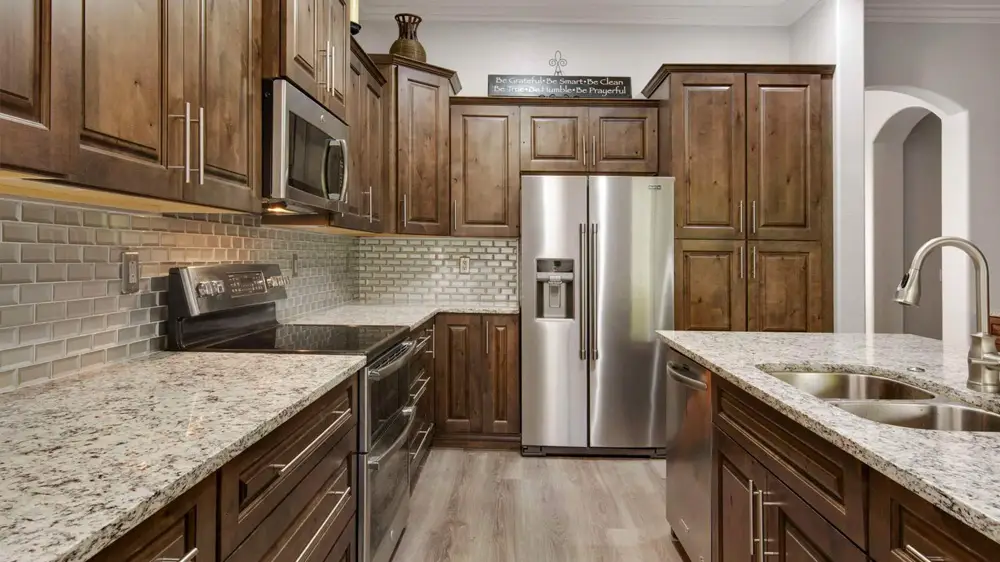
After years of painting over grain, wood is back on display. White oak led the return and is still strong, though darker species are picking up momentum: walnut, smoked oak, and the espresso-range stains Benjamin Moore’s 2026 pick points toward.
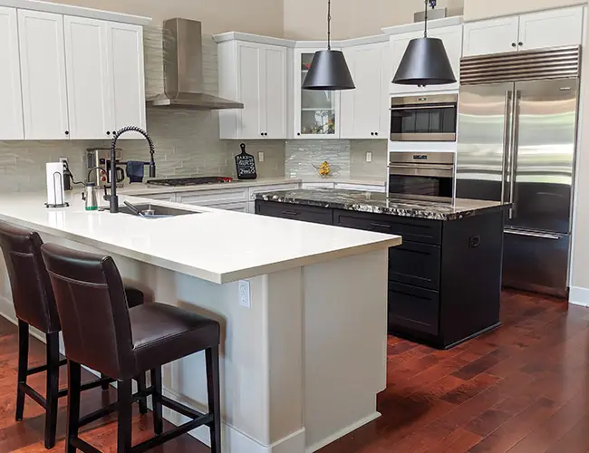
Most of the wood going into Valley kitchens is not a full wood kitchen. It is wood used deliberately in one place: a stained island against a painted perimeter, stained uppers over painted lowers, or a wood hood surround. That does two jobs. It adds warmth and texture, and it breaks up a large block of one color.
The two-tone pairings that consistently work: a warm neutral perimeter with a green or navy island; a cream perimeter with a stained wood island; or painted lowers with stained uppers. See finished combinations in our remodeling gallery.
See the colors in person
Our Phoenix showroom lets you hold cabinet doors against actual slabs, tile and flooring in one visit.
Tour the showroomWhat customers say
Phoenix homeowners love the results.
Showed up at their showroom / warehouse… picked out a countertop easily, scheduled, installed 2 weeks later. PHENOMENAL quality of installation.
Matthew S. · GoogleWe were able to find a countertop that fit our larger island without any seams, and at a great price as well.
Doug M. · GoogleGreat selections with reasonable price and very helpful workers.
Han D. · Google




What’s Fading Out
Two looks that defined the last decade are the ones designers now steer clients away from.
Cool, blue-based gray
The problem was rarely the gray. It was the undertone. Blue-based grays fight with warm floors, warm metals and most granite, and in rooms without much natural light they flatten out. Warm gray, greige and taupe deliver the same neutrality without that conflict. If you like gray, the fix is usually to go warmer, not to go elsewhere.
All-white, high-gloss kitchens
High gloss is the part that dates fastest. The sheen reads as a specific moment, and it magnifies every fingerprint, water spot and bit of dust, a real consideration in the desert. Matte and satin finishes have largely replaced it, and warmer whites have replaced the stark ones.
One caveat: out of fashion is not the same as bad. If your cabinets are structurally sound, new hardware and countertops often do more for the room than new doors.
How These Colors Read in Phoenix Light
This is where national trend lists stop being useful. Phoenix gets more direct sun, at a higher angle, for more of the year than almost anywhere these forecasts are written for.
Sun exposure
West- and south-facing kitchens take a beating from afternoon sun. Over years, that exposure can lighten saturated paint finishes and some stains, usually unevenly. The door in the light window shifts and its neighbor does not. Deep greens and reds are typically most susceptible; neutrals least. Low-E glass, window film, or simply keeping your boldest color off the sunniest wall all help.
Desert dust
Fine dust is constant here, and it settles visibly on very dark surfaces and very glossy ones. A high-gloss navy door needs wiping far more often than a matte greige. If you want a dark color and low upkeep, matte or low-sheen is the practical combination.
Hard water at the sink
Valley water is hard, and mineral spotting shows most on dark cabinet faces and polished hardware near the sink. Brushed and satin textures hide it better than polished chrome.
Monsoon humidity swings
Phoenix goes from very dry to humid and back within a season. Wood moves with that, and painted finishes can show hairline movement at door joints over time. Our cabinets are built with real wood rather than particle board, which handles moisture and stress better, more on our cabinets page.
Local tip: look at samples at 2 p.m. in summer, not just under showroom lighting. Phoenix midday light is bright, slightly cool, and it flattens mid-tones. A color that looks balanced in a showroom can read a shade lighter with the blinds open.
Pairing Cabinets with Counters, Hardware and Floors
Start with the countertop. It has the least flexibility. You are choosing from what nature and the manufacturers produced, not from a paint deck. Pick the slab, identify its undertone, then choose a cabinet color that lives comfortably with it.
| Cabinet color | Countertop pairings that work | Hardware that suits it |
|---|---|---|
| Deep green | Warm white and cream quartz, honed quartzite, gold-veined stone | Unlacquered or aged brass, champagne bronze |
| Navy and indigo | White and gray-veined quartz, lighter granite, marble-look slabs | Brass, matte black, brushed nickel |
| Warm neutral | Almost anything, warm-toned granite and quartzite especially | Matte black, bronze, brushed brass |
| Creamy white | Busier stone with movement; heavy veining reads well against a calm door | Brass, black, mixed metals |
| Natural wood | Quiet, low-movement slabs so the grain stays the focal point | Black, bronze, brushed stainless |
Hardware, briefly
Mixing metals is standard practice now. The guideline is two finishes, three at the outside, each repeated at least twice so it reads as intentional, commonly one on cabinet hardware, a second on plumbing and lighting. Champagne bronze and aged brass bring warmth without the yellow of polished brass; matte black remains the go-to for contrast.
Flooring and backsplash
The backsplash bridges the counter and the cabinets. If the countertop has a lot of movement, keep the backsplash and floor simple; if the counter is quiet, either can carry pattern. Browse our tile flooring alongside door samples, not after.
Narrowing It Down
A short process that tends to work:
- Choose the countertop first, then identify its undertone as warm or cool
- Stay on that side of the line for cabinets, floor and backsplash
- Decide on one color or two, and if two, where the darker one goes
- Get large door samples, not chips, and live with them a few days
- Check them in morning, midday and evening light in your own kitchen
- Confirm sheen, matte and satin hide dust and spotting better than gloss
- Choose hardware last, against the actual door and slab together
Kitchen size matters more than most trend articles admit. Smaller kitchens do better with lighter perimeters and color on a smaller run or island; larger ones can carry a deep color across the full perimeter. Orientation matters too. North-facing kitchens get flatter light, which is where warm undertones earn their keep.
Choosing Where to Buy Your Cabinets
Color selection gets easier when you can see everything in one place. Superior Stone & Cabinet is a one-stop shop for Phoenix-area kitchen and bath remodels: cabinet doors, slabs, tile and flooring under one roof at our showroom.
We carry several cabinet lines, so the color range is wide: KraftMaid, Oakcraft, Sollid, and our own Superior Cabinets line, hundreds of door styles and colors between them, plus custom options. Standard construction includes soft-close doors, six-way adjustable hinges, undermount drawer glides and dovetail drawer boxes.
Free 3D design services are part of the process: before you order, you get a digital rendering of your kitchen with your chosen color in your actual layout. We also handle countertops in granite, quartz, quartzite and marble, bathroom vanities, and full remodeling services, with our own installation teams and trusted trade partners coordinated as part of the project.
Free in-home estimates are available throughout the Phoenix metro, including Mesa, Tempe, Chandler, Gilbert, Peoria, Glendale and Scottsdale, see our full service areas.
Frequently Asked Questions
What cabinet colors are trending for 2026?
Three families lead 2026: deep nature-inspired greens such as olive, moss and forest; warm neutrals such as mushroom, greige, putty and khaki; and moody blues from classic navy to inky indigo. Natural wood stains in walnut and white oak are back as well. NKBA survey data puts green at the top of designer color preferences, with blue close behind.
Are white kitchen cabinets out of style in 2026?
No, but the type of white has changed. Stark blue-based whites and high-gloss finishes now read as dated to many designers, while creamy whites and soft off-whites remain very popular, often on a perimeter paired with a colored island. White is still one of the safest resale choices in the Phoenix market.
What is replacing gray kitchen cabinets?
Warmer versions of the same idea. Greige, mushroom, taupe, putty and khaki give the easy-to-live-with neutrality people wanted from gray, without the cool blue undertone that can make a kitchen feel flat. Sherwin-Williams named Universal Khaki SW 6150 its 2026 Color of the Year and Benjamin Moore chose Silhouette AF-655, a deep espresso brown.
Do dark cabinet colors work in Phoenix kitchens?
They can, with a few local considerations. Dark cabinets typically look best where there is good natural light or layered lighting, and where the room is large enough that the color does not close it in. Desert dust also shows more readily on very dark, very glossy surfaces, so many Valley homeowners pair a deep color with a matte or low-sheen finish.
What hardware finish goes with green or navy cabinets?
Warm metals are the usual pairing. Champagne bronze, aged brass and unlacquered brass all sit well against deep green and navy and warm up a cool-leaning color. Matte black gives a crisper, more graphic result. One local note: hard water spotting tends to show more on polished chrome, so brushed or satin textures often wear better near the sink.
Should I paint my whole kitchen one color or use two?
Two-tone remains one of the most popular approaches and is often easier to live with. A lighter perimeter with a colored island or colored lower cabinets lets you use a bold shade without committing the whole room. Single-color kitchens feel calmer and suit smaller footprints. Both are current, so kitchen size and natural light usually decide it.
How do I choose a cabinet color that will not look dated in five years?
Pick the countertop first, then choose a cabinet color that lives comfortably with its undertone, since the slab is typically the harder element to change later. Muted, complex shades tend to age better than highly saturated ones, and matte or satin finishes generally hold up better than high gloss. If you are unsure, keep the perimeter neutral.
Does Superior Stone & Cabinet help choose cabinet colors in Phoenix?
Yes. Superior Stone & Cabinet carries hundreds of door styles and colors across its cabinet lines and offers free 3D design services, so you can see a color in your own layout before ordering. The showroom at 3479 E University Dr lets you compare doors against actual slabs, tile and flooring in one trip. Free in-home estimates are available across the Phoenix metro.
Ready to pick your color?
Bring a countertop sample, a floor plan, or just a photo of your kitchen. Our designers will narrow the field with you and put your choice into a 3D rendering before anything is ordered.
Get a free in-home estimate Or call (602) 437-0088 · 3479 E University Dr, Phoenix, AZ 85034Keep reading
Related articles
4 Perfect Color Options for the Kitchen Cabinets
Deciding what color kitchen cabinets to get? Read our latest blog post to learn about four perfect color options for kitchen cabinets, and then call us!
Cabinets · November 8, 2024Exploring the Latest Trends in Cabinet Design
The contemporary kitchen cabinet has evolved into a focal point of kitchen décor, blending practicality with artistic expression.
Cabinets · September 10, 2024Cabinet Hardware Trends And Styles At Superior Stone & Cabinet
Are you looking to remodel your kitchen? Check out the cabinet hardware trends and styles at Superior Stone & Cabinet
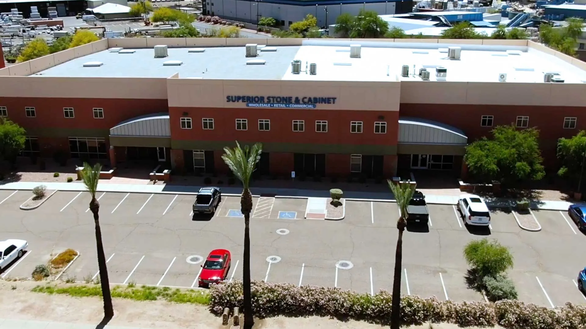
Visit the showroom & warehouse
See the cabinets in real kitchens.
Open the doors, compare door styles side by side, and talk with an on-site designer. No appointment needed.
| Mon – Fri | 8 am – 5 pm |
| Saturday | 10 am – 3 pm |
| Sunday | Closed |
| Warehouse pickup Mon–Fri 8 am – 3 pm | |